Fonts
UNC Lineberger uses the official University of North Carolina at Chapel Hill font collections, and suggest their use on any UNC Lineberger-related publications.
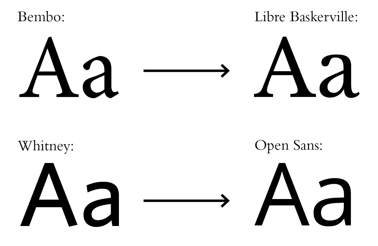
The official University typefaces are Bembo Std. and Whitney, and these are suggested for use on University print publications. Typefaces are licensed and are widely available for purchase. In the event that a unit does not have access to these fonts, other suggested fonts are Libre Baskerville and Open Sans.
For Print
The University’s standard serif and sans serif fonts are:
Bembo Std. (Serif)
| Bembo Std. – Regular | Bembo Std. – Italic | Bembo Std. – Bold |
|---|---|---|
 |
 |
 |
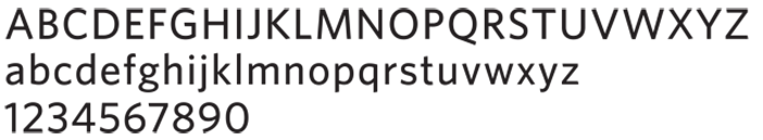
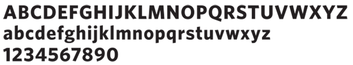
Whitney (Sans Serif)
| Whitney Medium | Whitney – Bold |
|---|---|
 |
 |
For the Web
These fonts are not generally available on computers, and are not considered safe for the web. In place of Bembo and Whitney, use Libre Baskerville and Open Sans, respectively. Use the following font families to style text in all web communications.
Font family, Serif: Libre Baskerville, serif
Font family, Sans Serif: Whitney, Open Sans, sans serif